Iris Apocalypse Now: Fisher's Data Rescaled
Tagged as: [8 May 2018 – The Machine Learning Repository at the Univerity of California, Irvine, states R.A. Fisher’s iris data set, first published in 1936, “is perhaps the best known database to be found in the pattern recognition literature.” I don’t think there is any user of R or Python who is not familiar with its 150 observations of three types of iris –- setosa, versicolor, and virginica.
Steven Slezak
8 May 2018
The Machine Learning Repository at the Univerity of California, Irvine, states R.A. Fisher’s iris data set, first published in 1936, “is perhaps the best known database to be found in the pattern recognition literature.” I don’t think there is any user of R or Python who is not familiar with its 150 observations of three types of iris – setosa, versicolor, and virginica.
A data set of n = 150 usually is considered too small to be representative, but for classification purposes this “toy” data set has fulfilled its role well.
But would a larger iris data set hurt? Might it even be useful? I mean, who can get too much sepal length in centimeters?
I decided to find out. So I created an iris data set consisting of almost 450,000 observations. I simulated the data using monte carlo methods then put them through an EDA to see if the characteristics of the original data set held through rescaling.
You be the judge.
But first, here are the packages used in the analysis. I decided to call on the new version of sjPlot for a change of pace from ggplot2. The library can be downloaded from CRAN but upon loading it urges users to go to the GitHub repo for the complete strengejacke package. The command is hashed out below.
I also decided to make use of the reticulate package. It allows Python code to be run in R. The command is hashed out below because it’s optional for this exercise, but if you want to use Seaborn the code is there.
#devtools::install_github("strengejacke/strengejacke")
library(tidyverse)
#library(sjPlot)
library(strengejacke)
library(gridExtra)
library(grid)
#library(reticulate)
The CSV file can be downloaded from GitHub. It consists on neary 450,000 rows (about 150,000 for each of the three varieties). It has the same structure as the original data set. You can work with the complete file or edit it down to a size more suitable for your purposes. The first 50 rows for each varietal consist of the original data. All the rest are simulated data.
IrisSimURL <- 'https://raw.githubusercontent.com/seslezak/seslezak.github.io/master/src/IrisData.csv'
IrisSim <- read.csv(url(IrisSimURL), sep = ",", header = TRUE, stringsAsFactors = TRUE)
In creating the IrisSim.csv simulated data set, I tried to preserve the statistical characteristics of the original as much as possible. Take a look at the structure of the data to confirm.
str(iris)
## 'data.frame':    150 obs. of  5 variables:
##  $ Sepal.Length: num  5.1 4.9 4.7 4.6 5 5.4 4.6 5 4.4 4.9 ...
##  $ Sepal.Width : num  3.5 3 3.2 3.1 3.6 3.9 3.4 3.4 2.9 3.1 ...
##  $ Petal.Length: num  1.4 1.4 1.3 1.5 1.4 1.7 1.4 1.5 1.4 1.5 ...
##  $ Petal.Width : num  0.2 0.2 0.2 0.2 0.2 0.4 0.3 0.2 0.2 0.1 ...
##  $ Species     : Factor w/ 3 levels "setosa","versicolor",..: 1 1 1 1 1 1 1 1 1 1 ...
str(IrisSim)
## 'data.frame':    441736 obs. of  5 variables:
##  $ SepalLength: num  4.9 4.8 4.3 5.2 4.9 4.9 4.7 5.3 5.5 5.5 ...
##  $ SepalWidth : num  3.1 3 3 4.1 3.1 3.1 3.5 3 3.1 3.2 ...
##  $ PetalLength: num  1.5 1.4 1.1 1.5 1.5 1.5 1.2 1.6 1.8 1.5 ...
##  $ PetalWidth : num  0.1 0.1 0.1 0.1 0.1 0.1 0.1 0.1 0.1 0.1 ...
##  $ Species    : Factor w/ 3 levels "Setosa","Versicolor",..: 1 1 1 1 1 1 1 1 1 1 ...
A summary of the two data sets also provides a useful basis for comparison.
summary(iris)
##   Sepal.Length   Sepal.Width    Petal.Length   Petal.Width
##  Min.   :4.30   Min.   :2.00   Min.   :1.00   Min.   :0.1
##  1st Qu.:5.10   1st Qu.:2.80   1st Qu.:1.60   1st Qu.:0.3
##  Median :5.80   Median :3.00   Median :4.35   Median :1.3
##  Mean   :5.84   Mean   :3.06   Mean   :3.76   Mean   :1.2
##  3rd Qu.:6.40   3rd Qu.:3.30   3rd Qu.:5.10   3rd Qu.:1.8
##  Max.   :7.90   Max.   :4.40   Max.   :6.90   Max.   :2.5
##        Species
##  setosa    :50
##  versicolor:50
##  virginica :50
##
##
##
summary(IrisSim)
##   SepalLength     SepalWidth    PetalLength     PetalWidth
##  Min.   :3.30   Min.   :0.40   Min.   : 0.0   Min.   :0.10
##  1st Qu.:5.20   1st Qu.:2.80   1st Qu.: 1.6   1st Qu.:0.30
##  Median :5.80   Median :3.00   Median : 4.4   Median :1.30
##  Mean   :5.84   Mean   :3.05   Mean   : 3.8   Mean   :1.21
##  3rd Qu.:6.50   3rd Qu.:3.30   3rd Qu.: 5.2   3rd Qu.:1.90
##  Max.   :9.70   Max.   :6.00   Max.   :10.7   Max.   :3.20
##        Species
##  Setosa    :141736
##  Versicolor:150000
##  Virginica :150000
##
##
##
This EDA is basically a visual inspection of the simulated data, so let’s create a few objects to work with on a Species basis.
irisVer <- subset(IrisSim, Species == 'Versicolor')
irisSet <- subset(IrisSim, Species == 'Setosa')
irisVir <- subset(IrisSim, Species == 'Virginica')
The documentation for the sjPlot package is very thorough so check it out if you wish to learn more about using this excellent graphics kit.
When using the sjPlot package, it is possible to set the graphic theme for subsequent visualization output. Here is code for a generic setting.
set_theme(theme = '539',
          geom.label.size = 3.5,
          axis.textsize = 0.8,
          axis.title.size = 0.9)
Most of the data visualization we are going to use will be done with boxplots so we are not doing sjPlot full justice.
FULL DISCLOSURE What follows is no doubt a violation of the DNRY principle, but I found it much easier (and much quicker) to simply change the column name and increment the object number than create a function to run through these examples. In some instances I had to adjust the arguments, as well, which would have made taking the function route even more complicated.
So is was a choice: violate DNRY or violate KISS (Keep it Simple, Stupid). I generally opt for simplicity. Everything in life is a tradeoff.
The number of outliers for SepalWidth might be a problem. A quick count shows there are about 10,400 outliers in this column. But the IQR of the original set and the simulated set is very similar. Some data cleaning might be in order for SepalLength, but the other colums exhibit less than 300 outliers.
b01 <- sjp.frq(IrisSim[, 'SepalLength'],
        type = 'box',
        geom.size = 0.3,
        inner.box.width = 5,
        ylim = c(0, 12.5),
        axis.title = 'Sepal Length',
        prnt.plot = FALSE)
b02 <- sjp.frq(IrisSim[, 'SepalWidth'],
        type = 'box',
        geom.size = 0.3,
        inner.box.width = 5,
        ylim = c(0, 12.5),
        axis.title = 'Sepal Width',
        prnt.plot = FALSE)
b03 <- sjp.frq(IrisSim[, 'PetalLength'],
        type = 'box',
        geom.size = 0.3,
        inner.box.width = 5,
        ylim = c(0, 12.5),
        axis.title = 'Petal Length',
        prnt.plot = FALSE)
b04 <- sjp.frq(IrisSim[, 'PetalWidth'],
        type = 'box',
        geom.size = 0.3,
        inner.box.width = 5,
        ylim = c(0, 12.5),
        axis.title = 'Petal Width',
        prnt.plot = FALSE)
grid.arrange(b01$plot, b02$plot, b03$plot, b04$plot, nrow = 1)
We can also examine the distribution of observations by feature for a single Species, in this case, by Versicolor.
b05 <- sjp.frq(irisVer[, 'SepalLength'], title = 'Versicolor',
        type = 'box',
        geom.size = 0.3,
        inner.box.width = 5,
        ylim = c(0, 6.7),
        axis.title = 'Sepal Length',
        prnt.plot = FALSE)
b06 <- sjp.frq(irisVer[, 'SepalWidth'],
        type = 'box',
        geom.size = 0.3,
        inner.box.width = 5,
        ylim = c(0, 7),
        axis.title = 'Sepal Width',
        prnt.plot = FALSE)
b07 <- sjp.frq(irisVer[, 'PetalLength'],
        type = 'box',
        geom.size = 0.3,
        inner.box.width = 5,
        ylim = c(0, 7),
        axis.title = 'Petal Length',
        prnt.plot = FALSE)
b08 <- sjp.frq(irisVer[, 'PetalWidth'],
        type = 'box',
        geom.size = 0.3,
        inner.box.width = 5,
        ylim = c(0, 7),
        axis.title = 'Petal Width',
        prnt.plot = FALSE)
grid.arrange(b05$plot, b06$plot, b07$plot, b08$plot, nrow = 1)
Next, by Setosa.
b09 <- sjp.frq(irisSet[, 'SepalLength'], title = 'Setosa',
              type = 'box',
              geom.size = 0.3,
              inner.box.width = 5,
              ylim = c(0, 6.7),
              axis.title = 'Sepal Length',
              prnt.plot = FALSE)
b10 <- sjp.frq(irisSet[, 'SepalWidth'],
              type = 'box',
              geom.size = 0.3,
              inner.box.width = 5,
              ylim = c(0, 7),
              axis.title = 'Sepal Width',
              prnt.plot = FALSE)
b11 <- sjp.frq(irisSet[, 'PetalLength'],
              type = 'box',
              geom.size = 0.3,
              inner.box.width = 5,
              ylim = c(0, 7),
              axis.title = 'Petal Length',
              prnt.plot = FALSE)
b12 <- sjp.frq(irisSet[, 'PetalWidth'],
              type = 'box',
              geom.size = 0.3,
              inner.box.width = 5,
              ylim = c(0, 7),
              axis.title = 'Petal Width',
              prnt.plot = FALSE)
grid.arrange(b09$plot, b10$plot, b11$plot, b12$plot, nrow = 1)
And finally by Virginica.
b13 <- sjp.frq(irisVir[, 'SepalLength'], title = 'Virginica',
               type = 'box',
               geom.size = 0.3,
               inner.box.width = 5,
               ylim = c(0, 10.5),
               axis.title = 'Sepal Length',
               prnt.plot = FALSE)
b14 <- sjp.frq(irisVir[, 'SepalWidth'],
               type = 'box',
               geom.size = 0.3,
               inner.box.width = 5,
               ylim = c(0, 11),
               axis.title = 'Sepal Width',
               prnt.plot = FALSE)
b15 <- sjp.frq(irisVir[, 'PetalLength'],
               type = 'box',
               geom.size = 0.3,
               inner.box.width = 5,
               ylim = c(0, 11),
               axis.title = 'Petal Length',
               prnt.plot = FALSE)
b16 <- sjp.frq(irisVir[, 'PetalWidth'],
               type = 'box',
               geom.size = 0.3,
               inner.box.width = 5,
               ylim = c(0, 11),
               axis.title = 'Petal Width',
               prnt.plot = FALSE)
grid.arrange(b13$plot, b14$plot, b15$plot, b16$plot, nrow = 1)
In the sections above, we looked at the simulated iris data in boxplots. Next, we will consider the distributions as histograms. We can start with base R histograms of the original Iris data set, then compare their shapes to what we find in the simulated data using sjPlot.
par(mfrow = c(1, 4))
hist(iris$Sepal.Length)
hist(iris$Sepal.Width)
hist(iris$Petal.Length)
hist(iris$Petal.Width)
b17 <- sjp.frq(IrisSim[, 'SepalLength'],
               axis.title = 'Sepal Length',
               show.values = FALSE,
               show.prc = FALSE,
               show.mean = TRUE,
               prnt.plot = FALSE)
b18 <- sjp.frq(IrisSim[, 'SepalWidth'],
               axis.title = 'Sepal Width',
               show.values = FALSE,
               show.prc = FALSE,
               show.mean = TRUE,
               prnt.plot = FALSE)
b19 <- sjp.frq(IrisSim[, 'PetalLength'],
               axis.title = 'Petal Length',
               show.values = FALSE,
               show.prc = FALSE,
               show.mean = TRUE,
               prnt.plot = FALSE)
b20 <- sjp.frq(IrisSim[, 'PetalWidth'],
               axis.title = 'Petal Width',
               show.values = FALSE,
               show.prc = FALSE,
               show.mean = TRUE,
               prnt.plot = FALSE)
grid.arrange(b17$plot, b18$plot, b19$plot, b20$plot, nrow = 1)
Next, we will consider a single feature – Petal Length – for each iris species. Note, in the Virginica graphic, a density curve and a normal distribution overlay the base histrogram.
b21 <- sjp.frq(irisVer[, 'PetalLength'], title = 'Versicolor',
               axis.title = 'Petal Length',
               show.values = FALSE,
               show.prc = FALSE,
               show.mean = TRUE,
               xlim = c(0, 10), ylim = c(0, 15000),
               prnt.plot = FALSE)
b22 <- sjp.frq(irisSet[, 'PetalLength'], title = 'Setosa',
               axis.title = 'Petal Length',
               show.values = FALSE,
               show.prc = FALSE,
               show.mean = TRUE,
               xlim = c(0, 10), ylim = c(0, 40000),
               prnt.plot = FALSE)
b23 <- sjp.frq(irisVir[, 'PetalLength'], title = 'Virginica',
               type = 'dens',
               normal.curve = TRUE,
               axis.title = 'Petal Length',
               show.values = FALSE,
               show.prc = FALSE,
               show.mean = TRUE,
               xlim = c(0, 10), ylim = c(0, 1),
               prnt.plot = FALSE)
grid.arrange(b21$plot, b22$plot, b23$plot, nrow = 1)
We can also superimpose a violin plot over our boxplots, as done below with all four features for all three iris species. It is clear that the violin plots mimic the distributions described above. The bimodal distributions of the petal data really stand out.
b24 <- sjp.frq(IrisSim[, 'SepalLength'],
               type = 'violin',
               geom.size = 0.3,
               inner.box.width = .2,
               ylim = c(0, 12.5),
               axis.title = 'Sepal Length',
               prnt.plot = FALSE)
b25 <- sjp.frq(IrisSim[, 'SepalWidth'],
               type = 'violin',
               geom.size = 0.3,
               inner.box.width = .1,
               ylim = c(0, 12.5),
               axis.title = 'Sepal Width',
               prnt.plot = FALSE)
b26 <- sjp.frq(IrisSim[, 'PetalLength'],
               type = 'violin',
               geom.size = 0.3,
               inner.box.width = .05,
               ylim = c(0, 12.5),
               axis.title = 'Petal Length',
               prnt.plot = FALSE)
b27 <- sjp.frq(IrisSim[, 'PetalWidth'],
               type = 'violin',
               geom.size = 0.3,
               inner.box.width = .05,
               ylim = c(0, 12.5),
               axis.title = 'Petal Width',
               prnt.plot = FALSE)
grid.arrange(b24$plot, b25$plot, b26$plot, b27$plot, nrow = 1)
We change gears now and shift attention to other statistical characteristics of the data. We will create a correlation table for the simulated iris data, and follow it up with a correlation graph.
corr <- cor(IrisSim[, -5], method = 'pearson',
    use = 'pairwise.complete.obs')
sjt.corr(corr)| SepalLength | SepalWidth | PetalLength | PetalWidth | |
|---|---|---|---|---|
| SepalLength | -0.317 | 0.748 | 0.753 | |
| SepalWidth | -0.317 | -0.447 | -0.416 | |
| PetalLength | 0.748 | -0.447 | 0.927 | |
| PetalWidth | 0.753 | -0.416 | 0.927 | |
| Computed correlation used pearson-method with listwise-deletion. | ||||
sjp.corr(corr)
We will finish up our EDA of the simulated iris data set. Most people who have worked with the original data set have created a pairs plot of the data, and many have color coded the data points by species. By now, it’s a data science cliche that looks something like this:
cols = c("red", "green", "blue")
pairs(iris[, -5], col = cols[iris$Species])
The reason UCI considers the iris data set a good example for pattern recognition is pretty evident in this classic pairs plot.
I tried to recreate this colorized version with the simulated data, but my little laptop couldn’t handle the demands on its graphics card so it output the data points all in black. You can see the data distribution is much fuller at a resolution of 440,000 compared to 150 data points.
Here is the version made with the simuated data. Be aware the computational demands slow down the output of this graphic substantially.
pairs(IrisSim[, -5], col = cols[iris$Species])
To finish up, I wanted to produce the pairs plot using the graphics contained in Python’s Seaborn library. If you are working with R 3.5.0 or better, the follow code should work. Just unhash the four lines of code below, and the line above for the reticulate library.
If you are working with an earlier version of R, you should probably consult an earlier post on using Seaborn in R.
#sns <- import('seaborn')
#plt <- import('matplotlib.pyplot')
#sns$pairplot(r_to_py(IrisSim[, -5]))
#plt$show()
Either way, you should end up with this output:
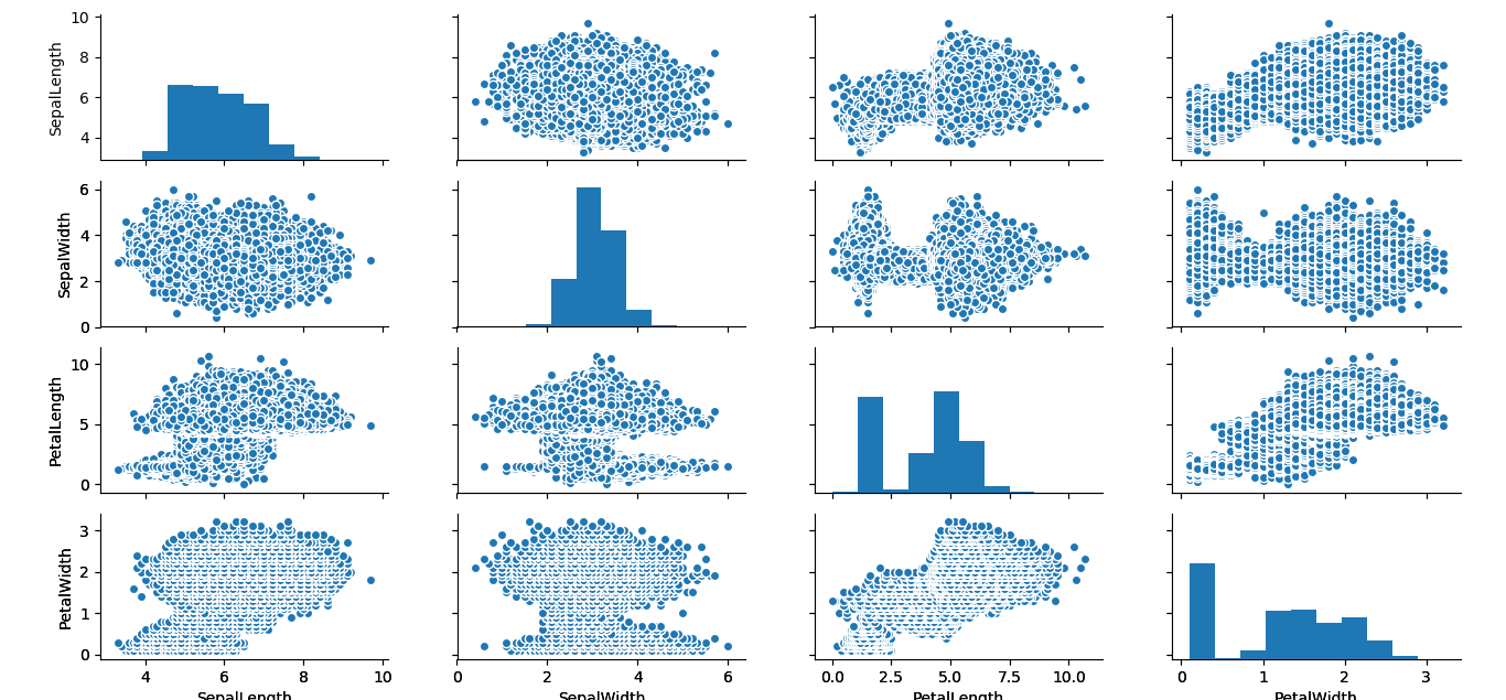
I really like the blue mushroom cloud effect the simulation creates. It suggests visions of an iris apocalypse.